Aircraft Cost Calculator
Digital Product
Role LEAD ux/ui designer
Client Chris Doerr, founder
Team kcoo

About
Aircraft Cost Calculator is a platform with a large aircraft database used for determining actual costs of aviation—designed for commercial operators, private owners, fractional owners, flight departments, charter operators, and financial institutions.
We were scoped to evaluate the user experience then re-design the ACC web application. The app had many different cost tools, an automated report generator, and a database of more than 500 different aircraft.

Evaluation
We used the application in its current state from different user perspectives to determine the steps where confusion occurs. We used these notes to analyze the problematic steps with different possibilities of usage and tested multiple solutions. After this and our heuristic review, we determined the optimum way for users to navigate through all the data was to section it into visible, automated parts.
The overwhelming amount of data in the original application was one of the problems that hindered the user experience. The ACC application had target audiences with a variety of goals and not all the data was necessary for each.
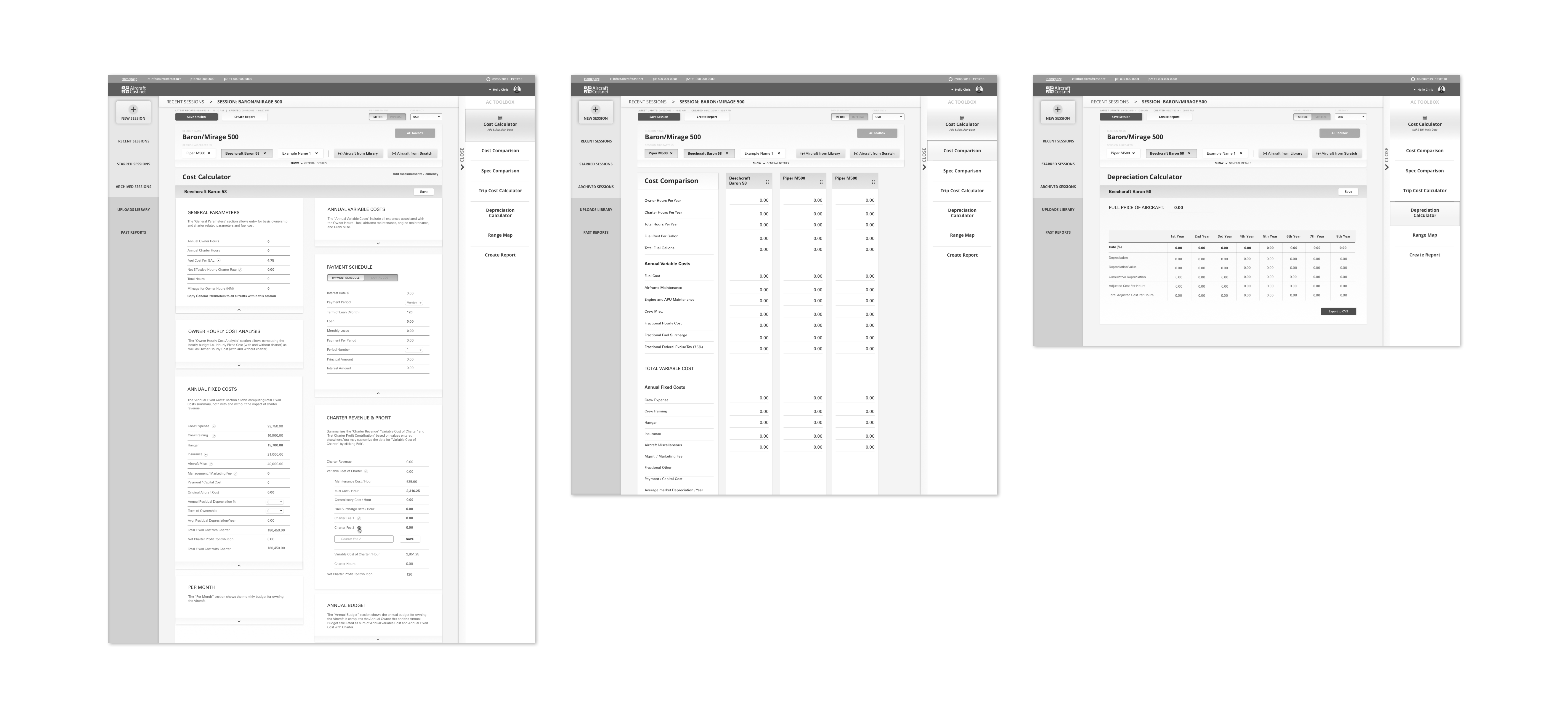
We organized the product's data into customizable sections where each user can easily navigate to what they need and move forward effortlessly to purchase a personal report of the specific information they curated throughout their session. A ‘session’ was the founder’s original concept and term used to represent the user’s set of calculations and comparisons for their chosen group of aircraft.

Challenges & Solutions
The founder provided some initial user insights that made it clear that we needed to clarify what a session actually was for a user while they are using the application.
The confusion of going through a "session" was clarified the best by separating the flow of going through a saved session versus starting a new session.

Another need was tool usage clarity. Some, but not all, of the tools are inactive until the user picks and adds aircraft to their process. We made sure to document correct timing to reveal the toolbar to the user, and that our design had clear affordances to indicate this to the user.
For active versus inactive function scenarios, at certain times we made use of grayed out and completely hidden CTAs and components. This was an intergral part of this redesign because the producted originally allowed use of all functions at all times which caused incorrect results.

One of our other biggest challenges was the users trying to browse through a vast amount of aircraft data.
We needed to improve the search for aircraft process for both users who knew what they are looking for and for those who didn't. The original categorization was only by aircraft type such as a jets, turboprops, or helicopters.
Therefore, we added more intuitive filters for both knowledgable users and laypeople, we and added a quick view option for each aircraft.
We also visually simplified the selection and de-selection of aircraft. We made this action an ever-present option on the dashboard during any individual session.
We also visually simplified the selection and de-selection of aircraft. We made this action an ever-present option on the dashboard during any individual session.


